Login pattern
The login pattern lets the user authenticate with a system for authorized access to product functionality.
Status:
Maintainer:
Overview
Login patterns ensure a user can authenticate into a system so they can access their data securely. Mobile login screens should follow the same pattern and illustration style as the desktop experience.
The “Forgot Password” pattern is separate from the authentication and login pattern. If there are several products requiring a login, a user should be able to choose which product to log into.
Login form variations
Centered login form
The centered login includes copyright information in the footer. Refer to your product content team for these details.
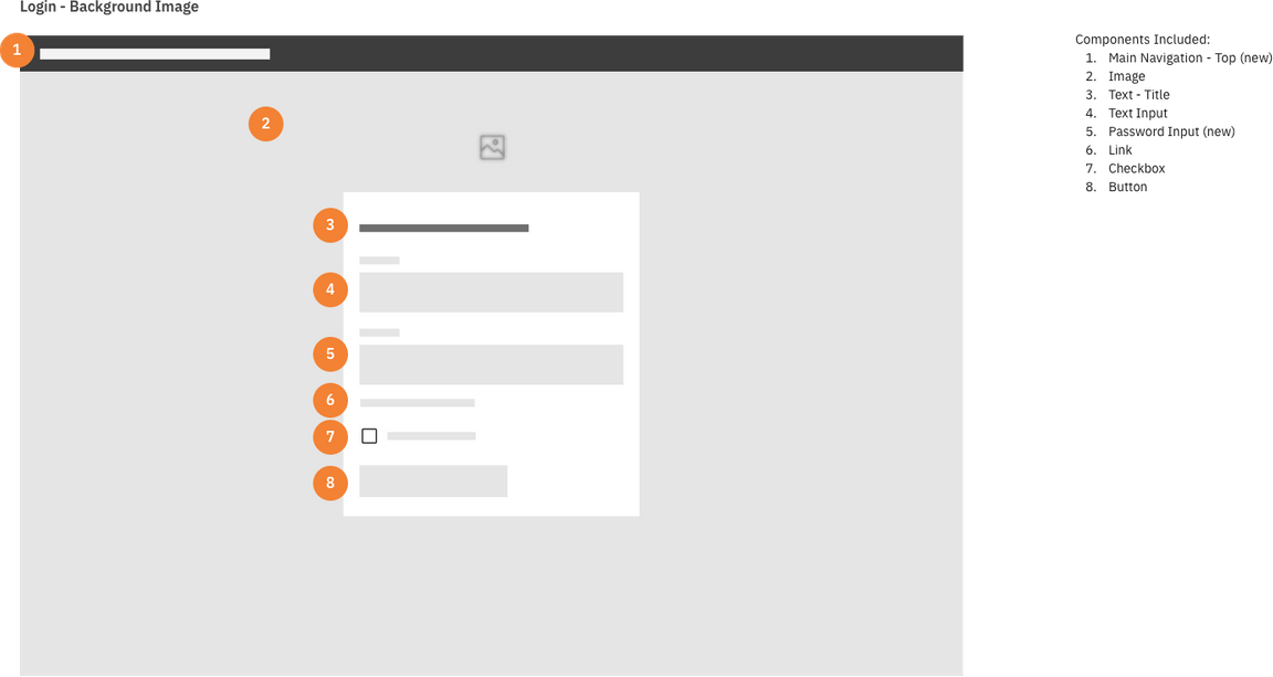
Wireframe of a centered login form
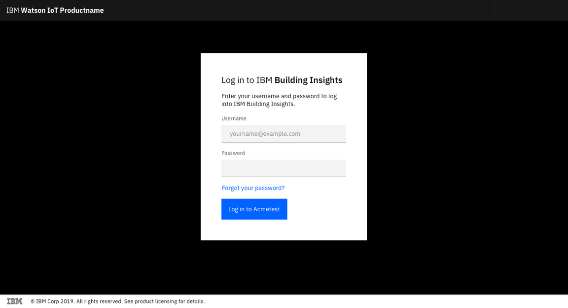
Example of a centered login form
If you choose to include an illustration, ensure the art reflects the product. Keep it simple and aligned with the product’s aesthetic.
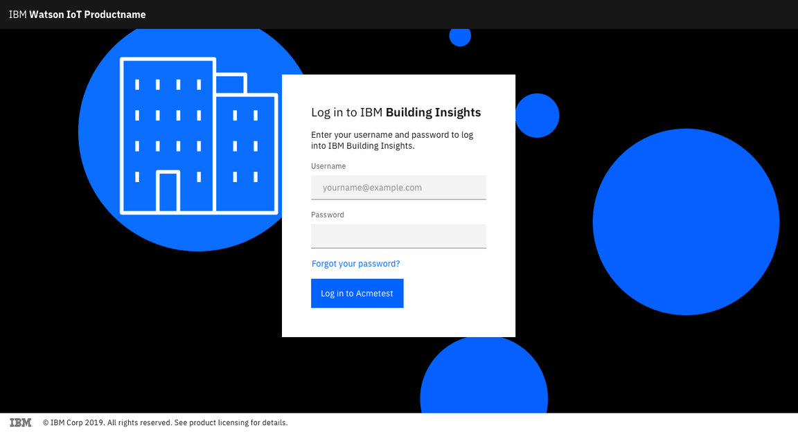
Example of a centered login form with illustration
Login form on the right
Right-side logins are ideal for editorial experiences and instances where there is visual content featured on the left side of the window.
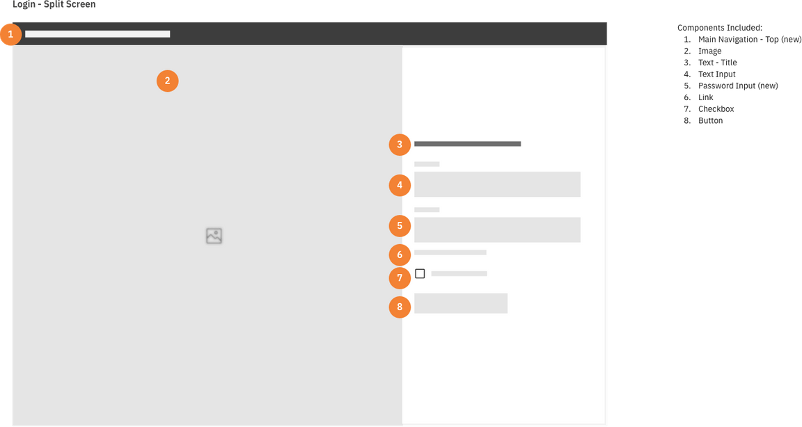
Wireframe of right-sided login form
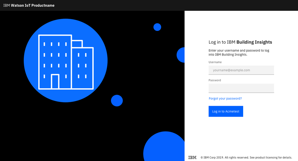
Example of right-sided login form
Login page with product selector
In some cases, you may ask the user to select which product to log into. This allows the user to jump directly to the home landing page for the product after authenticating.
Use a dropdown component to display the options.
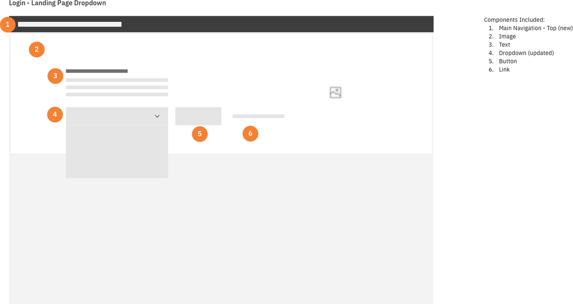
Wireframe of login page with product selector
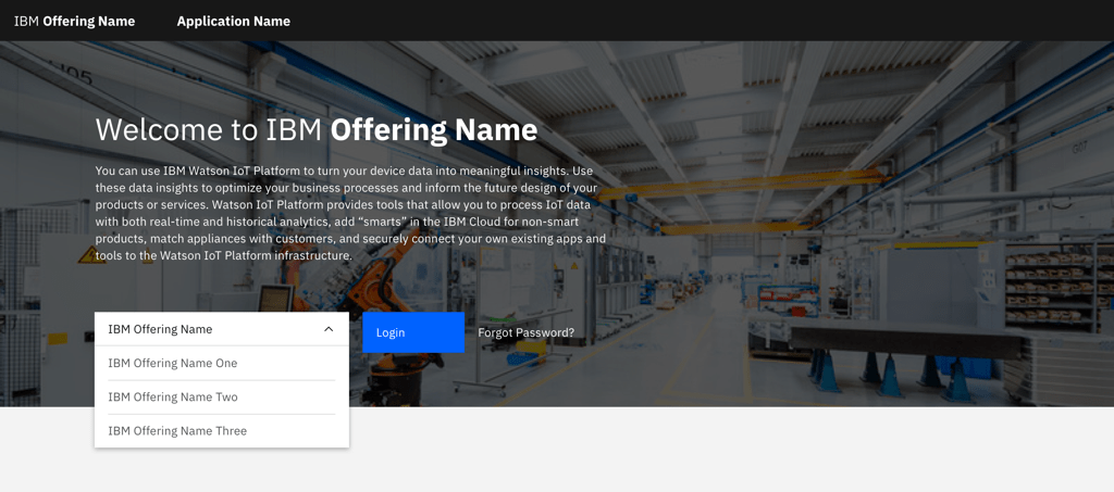
Example of login page with product selector