Cards
Specs
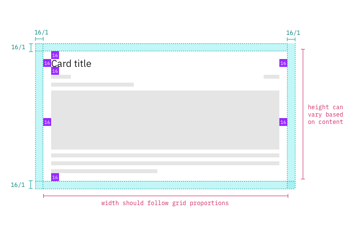
Cards have 16px | 1 rem margins all around, including dashboard widgets.

Structure and spacing measurements for small side panels | px | rem.
Typography
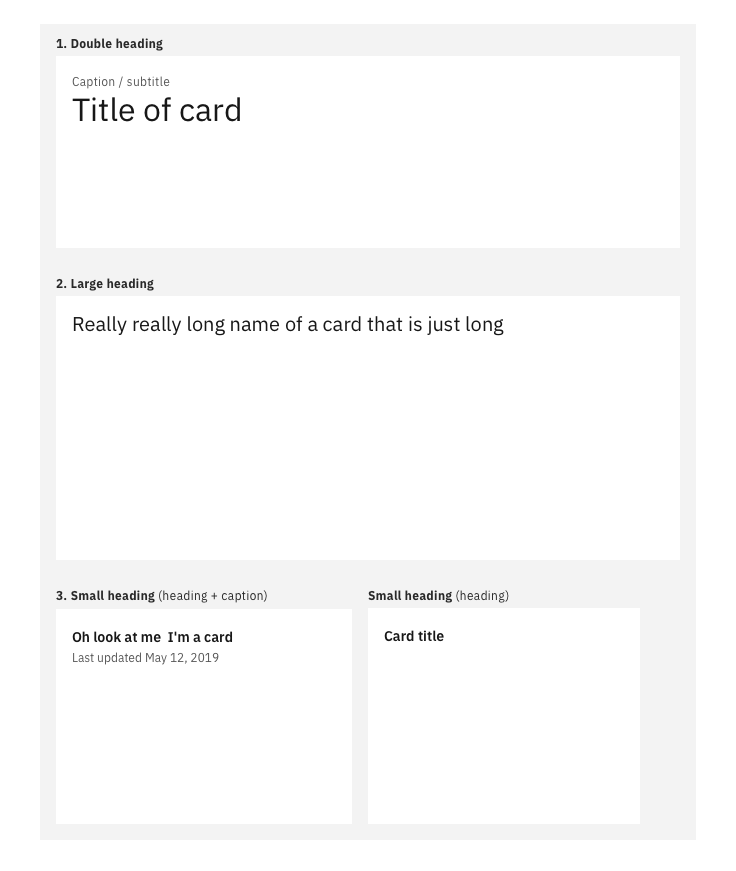
All card titles, captions and labels are set in sentence case. Set body text appropriately based on content.

Structure and spacing measurements for small side panels | px | rem.
Double heading
| Type | Carbon token | rem | px |
|---|---|---|---|
| Title | productive-heading-05 | 2 | 32 |
| Caption / subtitle | label-01 | 1 | 16 |
Large heading
| Type | Carbon token | rem | px |
|---|---|---|---|
| Title | heading-03 | 1.25 | 20 |
Small heading (heading and caption)
| Type | Carbon token | rem | px |
|---|---|---|---|
| Title | productive-heading-01 | 0.875 | 14 |
| Caption / subtitle | label-01 | 1 | 16 |
Body
| Body text / Descriptions | Carbon token | rem | px |
|---|---|---|---|
| Cards with < 4 lines) | body-short-01 | 0.875 | 14 |
| Cards with > 4 lines) | body-long-01 | 0.875 | 14 |
Color
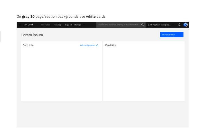
For general card usage, use a white card when the page background color is gray 10.
If you need to draw attention to a card with unique content such as a special offering on the catalog page, use a gray 90 or gradient color background for the card. Please refrain from using marketing messages that may cause the user to percieve the card as an advertisement.

On gray 10 page/section backgrounds use white cards.
On white page/section backgrounds or places where you want to draw attention use gray 90 cards.
Buttons and links
Cards use floating default buttons (primary, secondary, ghost, etc.) Arrow icons can also be used in cards on overview pages.